Friday, 3 August 2012

You block my world...

Coming from an art-dealing home, I know how easy it is to end up living in a gallery and not a home. This Cadiz house designed by architect Pedro Ribeiro Pita looks incredibly beautiful, but when you start putting furniture in it will all start competing with the art (and I don't meant the furniture you put in straight away, I mean the stuff you end up buying a few years down the line when your invisible cupboards and built-in wardrobes fill up!). But fear not, as the colour-block effect comes in "practical" too...


Belgian designer Koenraad Ruys for company Moca, provides the same striking elegance and colour injection in the Framed Sideboard


As do the modular units of the Hillside Shelving System by Claesson Koivisto Rune for the company Arflex
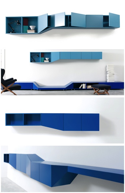


DIOTTI A&F  do a similar line of modular units with a more "tetris" style design. Some of their colour combinations are more successful than others.


And if storage wasn't practical enough, you could go the whole hog and colour-block-module the kitchen, like Danielle Lago


Or if you want you blocks of colour a little less "blocky" you could follow the lead of Spanish architect Alejandro Muñoz Miranda, who designed this striking kindergarden in Granada. Children really have all the luck.


And the DIY approach? Just attack your current cabinets with Farrow and Ball's brightest. 

http://www.lago.it/

The Inner Artist...

Art School campaigns have a real tendency to be worthy and contrived. Not so for recent posters by MASP in Sao Paulo, whose witty and wonderful images of artists dissected really stand out. The campaign only depicts Dali, Van Gogh and Picasso, but it's a real pity they stopped at 3. Damien Hirst's organs in glass and formaldehyde? Monet's impressionist intestines? Warhol's screen-printed stomach? Bacon's disjoined digestive tract? Paolozzi's pixelated pelvis? Gormley's iron innards? I could go on... 


Flat Envy...

So apparently this Rue Le Notre apartment is 'star-shaped' and therefore presented design duo powerhouse SO-AN with a whole host of challenges. I love the "Contemporary James Bond" mood, but, unless these photos just don't show it, I don't see enough of the quirky angles and shapes that must come with such a sprawling layout.


House envy...

Ahhh, the Olson Kundig "Brain" House. Staple fodder for design blogs, but it's always worth a perv. I've been terrible at blogging recently, as I'm in Australia visiting the parents, who don't get internet access or phone reception in the wilds of Far North Queensland. Looking around me at the ever rotting pole home, that needs more maintenance to keep the moisture at bay than a ship, I cannot for the life of me see why we just didn't build something like "The Brain". The intellectual bunker look just can't be beaten in tropical climes. If you don't know the architects, they're a name worth knowing - taking design from where Lloyd Wright left off, and turning it into a more subtle statement.


Designer Envy...

Another day, another set of coveted dwellings. Today it's from the Turkish interior stylists at Autoban, whose aesthetic I rate highly. In their Tunel property I love the marriage of stripped back loft style bricks and ornate townhousey cornicing. It looks easy to replicate, but I suspect the overall effect would be quite hard to achieve as everything in there is super designer and screams quality and if you used reproduction goods it just wouldn't have that sheen. Without wanting to be too practical, I also suspect that unless you could pay someone to dust in all those brickwork cracks, that zesty white would be marred by dust in a matter of days.


The same blend of traditional features with modern colour schemes and scandi furniture continues in their other projects, such as the Beyoglu apartment they did in 2006. And mirrored tiles in the kitchen - years before anyone else.


Their staple style takes in a slightly more Parisian feel in the Ayazpasa house


Wednesday, 1 August 2012

"I'd like a flat with light spilling in..."

A tidal wave of cascading light and broken glass by sculptor  Baptiste Debombourg starts off a year of cultural events in a former Benedictine abbey in Pulheim, Germany. Quite a lot has been written about the Aérial  exhibition, but frankly it's all a bit too pretentious and critical. I shan't impose my ideas on you, as I think the installation is quite beautiful enough by itself, and that pure image gets too tainted when you start thinking about it being in a room that was once used as a concentration camp.


Tuesday, 10 July 2012

House envy...

Modern architecture really can improve, as well as save abandoned ruins. Success stories like this really make me want to yell at fusty institutions like British Heritage, who seem to prefer buildings on the 'at risk register' to sit and crumble waiting for someone to rebuild them as working museums, rather than give them the freedom to turn them into something new and wonderful, as
David Closes has done to the convent of Sant Francesc in Santpedor, Spain. Built between 1721 and 1729, then demolished in 2000, of the original building only the church remains, which has been undergoing renovations since 2003. 
Closes has managed to preserve the historical legacy of the building (scars included), with the addition of new values. Without losing sight of the architectural unity, the church is now an auditorium and multifunctional cultural space.


Monday, 9 July 2012

The fairest of them all...

Oskar Kohnen and Fabian Freytag's company LecaroliMited have produced a truly modern Berlin penthouse. It's a brave gamble, but I think it works beautifully, providing you always put everything away in unseen storage and wiped fingermarks off as you go. But what a vehicle for modern art!


Not brave enough to cover the whole house in mirrors? The mirrored tile trend is really gathering pace, good for catching natural light on surfaces that rarely see them, and a clean look for kitchens and bathrooms.