Coming from an art-dealing home, I know how easy it is to end up living in a gallery and not a home. This Cadiz house designed by architect Pedro Ribeiro Pita looks incredibly beautiful, but when you start putting furniture in it will all start competing with the art (and I don't meant the furniture you put in straight away, I mean the stuff you end up buying a few years down the line when your invisible cupboards and built-in wardrobes fill up!). But fear not, as the colour-block effect comes in "practical" too...
Belgian designer Koenraad Ruys for company Moca, provides the same striking elegance and colour injection in the Framed Sideboard
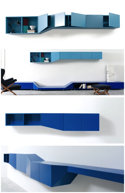
As do the modular units of the Hillside Shelving System by Claesson Koivisto Rune for the company Arflex
DIOTTI A&F do a similar line of modular units with a more "tetris" style design. Some of their colour combinations are more successful than others.

And if storage wasn't practical enough, you could go the whole hog and colour-block-module the kitchen, like Danielle Lago
Or if you want you blocks of colour a little less "blocky" you could follow the lead of Spanish architect Alejandro Muñoz Miranda, who designed this striking kindergarden in Granada. Children really have all the luck.
And the DIY approach? Just attack your current cabinets with Farrow and Ball's brightest.
http://www.lago.it/


No comments:
Post a Comment